Charlton House
Charlton House was an evolution of the education arm of the CH&CO family – developed to serve a focused purpose: delivering exceptional, progressive catering exclusively for independent and boarding schools. The vision was to deliver something beyond just food – to create welcoming, future-focused environments where students could feel respected, connect, and feel at home.
The creative direction focused on building something that felt premium yet personable, blending hospitality-level service with the warmth and consistency students need – particularly those living on campus full-time. We developed a dual-tone brand language: bold and expressive in print and digital, with vibrant menus, playful colour accents and engaging copy; and a more calm, grounded and tactile approach in physical spaces.
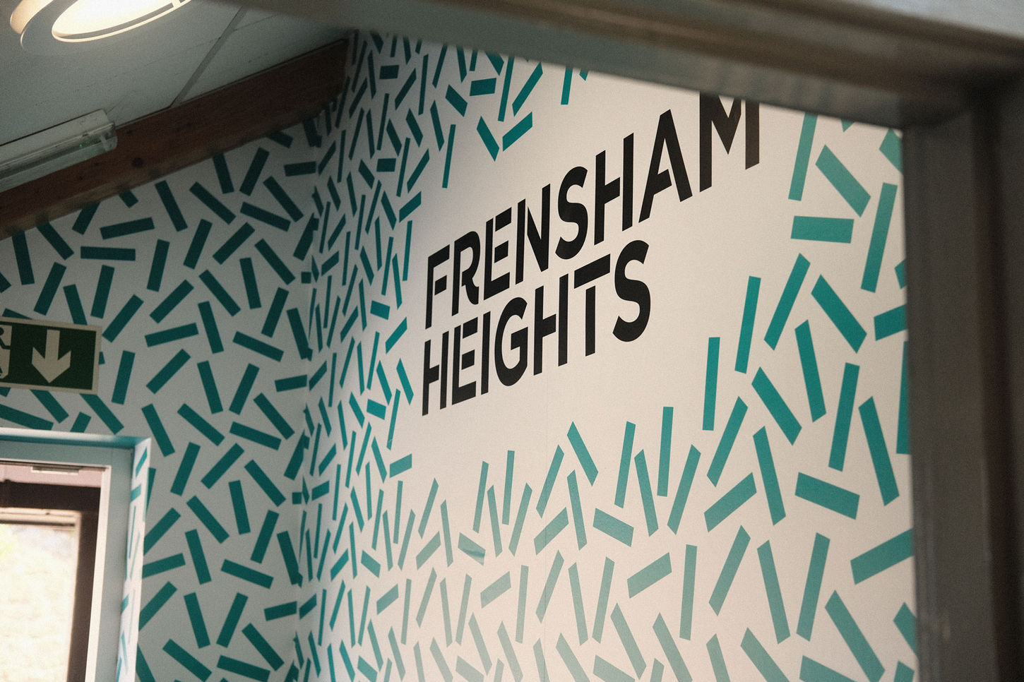
Working closely with the interior design teams, I ensured that the brand identity wasn’t just seen – it was felt. From countertop materials and wayfinding graphics to printed collateral and menus, every detail was designed to enhance the day-to-day student experience.The strategic goal was clear: to establish Charlton House as the go-to catering brand for premium independent schools, distinct from the wider CH&CO group. That meant rethinking everything – from positioning through to tone of voice, rollout and daily implementation across two flagship sites: Frensham Heights and Papplewick School.
We began by building a brand framework grounded in three core values: nurture, quality and presence. This informed the visual system – modern, fresh, and flexible enough to scale across diverse settings – and also shaped the storytelling approach behind all print, digital and spatial assets.
Print and digital comms leaned into vibrancy and variety, with bold layouts and student-facing language designed to increase engagement with the food offer. But in the dining spaces themselves, the tone softened – menus were presented with clarity and calm, signage was understated, and graphic elements worked in harmony with lighting, colour and wayfinding. This duality allowed the brand to show up differently depending on context, but always feel like one cohesive experience.
The results were immediate, Student engagement with special menus and themed days increased by 40% within the first term. Internally, the Charlton House brand toolkit reduced rollout time by over 30% compared to previous school launches.


to be continued
TIKTOK
SUBSTACK
contact
07534 3303 94
Art Direction
Brand Building
Marketing Strategy
Print + Digital Design
Charlton House
Charlton House was an evolution of the education arm of the CH&CO family – developed to serve a focused purpose: delivering exceptional, progressive catering exclusively for independent and boarding schools. The vision was to deliver something beyond just food – to create welcoming, future-focused environments where students could feel respected, connect, and feel at home.
The creative direction focused on building something that felt premium yet personable, blending hospitality-level service with the warmth and consistency students need – particularly those living on campus full-time. We developed a dual-tone brand language: bold and expressive in print and digital, with vibrant menus, playful colour accents and engaging copy; and a more calm, grounded and tactile approach in physical spaces.
Working closely with the interior design teams, I ensured that the brand identity wasn’t just seen – it was felt. From countertop materials and wayfinding graphics to printed collateral and menus, every detail was designed to enhance the day-to-day student experience.The strategic goal was clear: to establish Charlton House as the go-to catering brand for premium independent schools, distinct from the wider CH&CO group. That meant rethinking everything – from positioning through to tone of voice, rollout and daily implementation across two flagship sites: Frensham Heights and Papplewick School.
We began by building a brand framework grounded in three core values: nurture, quality and presence. This informed the visual system – modern, fresh, and flexible enough to scale across diverse settings – and also shaped the storytelling approach behind all print, digital and spatial assets.
Print and digital comms leaned into vibrancy and variety, with bold layouts and student-facing language designed to increase engagement with the food offer. But in the dining spaces themselves, the tone softened – menus were presented with clarity and calm, signage was understated, and graphic elements worked in harmony with lighting, colour and wayfinding. This duality allowed the brand to show up differently depending on context, but always feel like one cohesive experience.
The results were immediate, Student engagement with special menus and themed days increased by 40% within the first term. Internally, the Charlton House brand toolkit reduced rollout time by over 30% compared to previous school launches.


