Healthcare Media Europe
Healthcare Media Europe (HME) is a specialist agency working at the intersection of healthcare and marketing – a sector where credibility, clarity and trust are everything. When they approached myself, their brand identity no longer reflected the scale, experience or positioning of the business. The visual language was dated, inconsistent, and lacked the structure needed to grow across international markets and digital platforms.
The direction was to evolve – not erase – the brand. We revisited the roots of classic medical design ephemera: clean layouts, purposeful grids, technical contrast and a deep sense of hierarchy. From this foundation, we created a new identity that felt modern, minimal, and distinct – grounded in legacy but ready for the future.
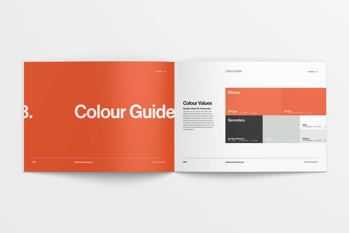
Typography became the anchor of the brand system. A highly legible, geometric sans-serif created visual balance, while the colour palette – restrained but confident – supported use across both digital and print. The logomark was simplified and rebalanced to sit cleanly across applications, from pitch decks to international pharma exhibition stands.
At the core of the new system was a design language rooted in practicality, precision and neutrality – allowing HME’s work to take the spotlight, while reinforcing their credibility through every touchpoint.HME needed to reposition themselves as a confident, contemporary player in global healthcare communications – a partner trusted by pharmaceutical leaders, biotech firms, and healthcare systems across Europe and beyond.
The previous brand structure lacked the consistency and authority expected in a sector driven by regulation and technical knowledge. The goal was to deliver a visual identity that projected clarity, capability and competence – while remaining flexible enough to accommodate a wide range of healthcare sub-specialties and markets.
Through discovery workshops with the leadership team, we defined key brand pillars around: credibility over creativity – design should support the message, never distract; international consistency – a system that could scale cleanly across languages, clients and geographies; timelessness – a look and feel that wouldn’t age quickly or fall into trend-driven traps.
The result was a fully restructured brand built on utility and confidence. A comprehensive set of guidelines supported rollout across corporate materials, digital templates, and multilingual collateral.


to be continued
TIKTOK
SUBSTACK
contact
07534 3303 94
Art Direction
Brand Building
Marketing Strategy
Print + Digital Design
Healthcare Media Europe
Healthcare Media Europe (HME) is a specialist agency working at the intersection of healthcare and marketing – a sector where credibility, clarity and trust are everything. When they approached myself, their brand identity no longer reflected the scale, experience or positioning of the business. The visual language was dated, inconsistent, and lacked the structure needed to grow across international markets and digital platforms.
The direction was to evolve – not erase – the brand. We revisited the roots of classic medical design ephemera: clean layouts, purposeful grids, technical contrast and a deep sense of hierarchy. From this foundation, we created a new identity that felt modern, minimal, and distinct – grounded in legacy but ready for the future.
Typography became the anchor of the brand system. A highly legible, geometric sans-serif created visual balance, while the colour palette – restrained but confident – supported use across both digital and print. The logomark was simplified and rebalanced to sit cleanly across applications, from pitch decks to international pharma exhibition stands.
At the core of the new system was a design language rooted in practicality, precision and neutrality – allowing HME’s work to take the spotlight, while reinforcing their credibility through every touchpoint.HME needed to reposition themselves as a confident, contemporary player in global healthcare communications – a partner trusted by pharmaceutical leaders, biotech firms, and healthcare systems across Europe and beyond.
The previous brand structure lacked the consistency and authority expected in a sector driven by regulation and technical knowledge. The goal was to deliver a visual identity that projected clarity, capability and competence – while remaining flexible enough to accommodate a wide range of healthcare sub-specialties and markets.
Through discovery workshops with the leadership team, we defined key brand pillars around: credibility over creativity – design should support the message, never distract; international consistency – a system that could scale cleanly across languages, clients and geographies; timelessness – a look and feel that wouldn’t age quickly or fall into trend-driven traps.
The result was a fully restructured brand built on utility and confidence. A comprehensive set of guidelines supported rollout across corporate materials, digital templates, and multilingual collateral.


