Stokes Farm Barn
I was approached Stokes Farm Barn, a family-run working farm and events space in Berkshire, to deliver a full brand refresh. With their offering expanding ahead of the 2024 season, the team recognised the need for a new identity – one that could reflect their agricultural roots, while setting the tone for elegant, design-led events unlike anything else in the South of England.
The focus was on balance; retaining the rustic charm and authenticity that long-time clients and suppliers associated with the brand, but introduced a much softer, more refined visual language to elevate the experience. Typographic choices became more graceful and spacious; the colour palette moved towards warm neutrals and soft earth tones, referencing both the venue’s natural surroundings and the delicate, emotional quality of weddings.
The new brand was built to reflect the full journey – from enquiry and invitation through to the day itself. Every touchpoint was reimagined with care and craft, ensuring the experience felt personal, premium and effortlessly memorable.Rather than lean into predictable “barn wedding” tropes, we positioned the venue as something more curated and emotionally resonant – a space with character and credibility that didn’t need to shout. The design system was built to flex: structured and elevated for wedding communications, but still rooted in warmth and honesty for day-to-day operational use.
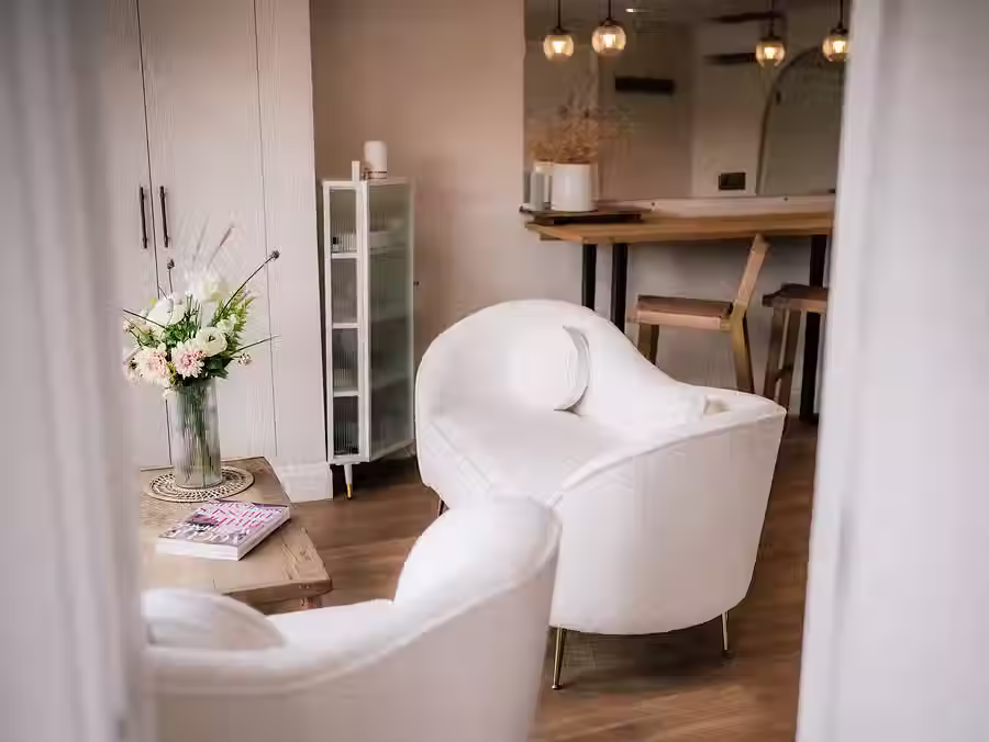
Print and digital collateral – from brochures to menus to signage to their website – was approached with the same care the venue gives to its guests. Material choices, typography, custom illustrations and layout all worked to evoke a sense of calm confidence, reflecting the kind of experience couples could expect from the venue itself. Across the site, signage and wayfinding were carefully considered not only for practicality, but as part of the visual storytelling – guiding guests through spaces that felt intentional and beautifully thought through. On-site art direction was key to guide the overall look and feel of the venue’s public spaces – blending natural textures, subtle branding implementation and seasonal flexibility.
The result is a brand that finally matches the quality of the offering. Since the relaunch, the venue has seen a tangible increase in wedding enquiries and secured a stronger presence in the minds of planners and suppliers.


to be continued
TIKTOK
SUBSTACK
contact
07534 3303 94
Art Direction
Brand Building
Marketing Strategy
Print + Digital Design
Stokes Farm Barn
I was approached Stokes Farm Barn, a family-run working farm and events space in Berkshire, to deliver a full brand refresh. With their offering expanding ahead of the 2024 season, the team recognised the need for a new identity – one that could reflect their agricultural roots, while setting the tone for elegant, design-led events unlike anything else in the South of England.
The focus was on balance; retaining the rustic charm and authenticity that long-time clients and suppliers associated with the brand, but introduced a much softer, more refined visual language to elevate the experience. Typographic choices became more graceful and spacious; the colour palette moved towards warm neutrals and soft earth tones, referencing both the venue’s natural surroundings and the delicate, emotional quality of weddings.
The new brand was built to reflect the full journey – from enquiry and invitation through to the day itself. Every touchpoint was reimagined with care and craft, ensuring the experience felt personal, premium and effortlessly memorable.Rather than lean into predictable “barn wedding” tropes, we positioned the venue as something more curated and emotionally resonant – a space with character and credibility that didn’t need to shout. The design system was built to flex: structured and elevated for wedding communications, but still rooted in warmth and honesty for day-to-day operational use.
Print and digital collateral – from brochures to menus to signage to their website – was approached with the same care the venue gives to its guests. Material choices, typography, custom illustrations and layout all worked to evoke a sense of calm confidence, reflecting the kind of experience couples could expect from the venue itself. Across the site, signage and wayfinding were carefully considered not only for practicality, but as part of the visual storytelling – guiding guests through spaces that felt intentional and beautifully thought through. On-site art direction was key to guide the overall look and feel of the venue’s public spaces – blending natural textures, subtle branding implementation and seasonal flexibility.
The result is a brand that finally matches the quality of the offering. Since the relaunch, the venue has seen a tangible increase in wedding enquiries and secured a stronger presence in the minds of planners and suppliers.