Waterside Quarter
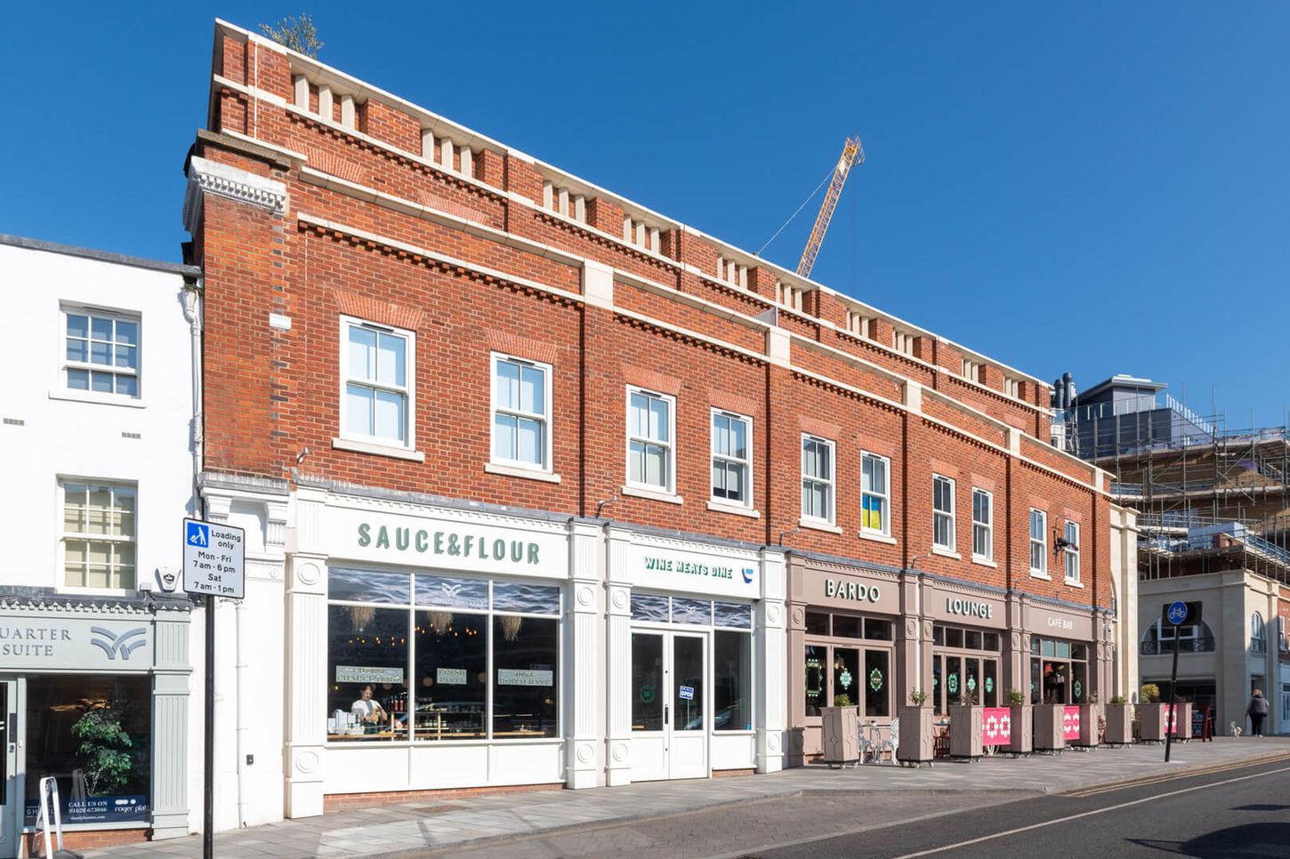
Waterside Quarter is a new cultural and culinary destination in the heart of Maidenhead – an ambitious development by Sorbon Estates designed to bring life back to the riverside through food, fitness and vibrant public space. I was commissioned to develop the full brand identity, creative direction and on-the-ground visual language for the site.
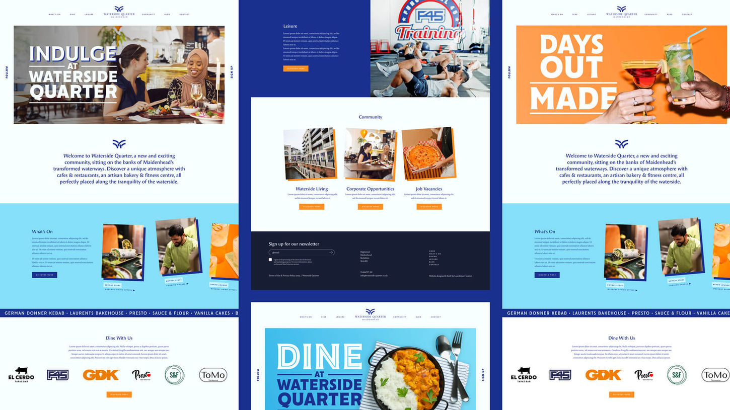
The brand was built around three clear creative pillars – Vibrancy, Excitement, and Hospitality – drawing visual and tonal cues from modern hospitality design, riverside movement, and the area's evolving cultural identity. The result was a bold but flexible identity system: soft blues and vivid oranges met structured typography, layered graphics and expressive patterns to capture a sense of motion and place.
From the logo to the headlines, everything was built to scale – to live confidently on signage, posters, hoardings, and digital channels alike. And critically, it was built to unify a diverse range of vendors under one memorable, connected identity.The strategy behind Waterside Quarter was to create a cohesive, ownable brand that could bring together dozens of independent businesses under one shared banner – without compromising their individuality. Through that lens, I developed a tone and style that could flex between different audiences – from young families and commuters to foodies and fitness-goers – while always reinforcing a clear sense of place. This was Maidenhead, made.
To support this, I directed multiple photoshoots across the site – capturing food, movement, and energy in a way that could represent all vendors equally. Styled photography was used for abstract food shots and brand-led campaigns, while lifestyle imagery focused on real people and moments of interaction within the space. This gave the brand an immediate sense of life, humanity, and rhythm.
The deliverables included a full creative suite, logo, colour system, typography and graphic language, marketing straplines and tone of voice. A full website, social and digital marketing templates. Print collateral, including promotional leaflets, event posters, branded wraps and window vinyls, and custom signage across the development, from wayfinding and entrances to wall murals and vendor directories
The impact was immediate. The new brand became a unifying thread throughout the space – giving vendors a shared visual platform to market from, and helping visitors easily navigate and engage with the Quarter as a whole. Footfall increased following the relaunch campaign, with stronger dwell times and higher social engagement thanks to bold, photo-ready visual moments. The branding has now been adopted across multiple partner communications, aiding the repositioning of Waterside Quarter as Maidenhead’s new heart of hospitality.


to be continued
TIKTOK
SUBSTACK
contact
07534 3303 94
Art Direction
Brand Building
Marketing Strategy
Print + Digital Design
Waterside Quarter
Waterside Quarter is a new cultural and culinary destination in the heart of Maidenhead – an ambitious development by Sorbon Estates designed to bring life back to the riverside through food, fitness and vibrant public space. I was commissioned to develop the full brand identity, creative direction and on-the-ground visual language for the site.
The brand was built around three clear creative pillars – Vibrancy, Excitement, and Hospitality – drawing visual and tonal cues from modern hospitality design, riverside movement, and the area's evolving cultural identity. The result was a bold but flexible identity system: soft blues and vivid oranges met structured typography, layered graphics and expressive patterns to capture a sense of motion and place.
From the logo to the headlines, everything was built to scale – to live confidently on signage, posters, hoardings, and digital channels alike. And critically, it was built to unify a diverse range of vendors under one memorable, connected identity.The strategy behind Waterside Quarter was to create a cohesive, ownable brand that could bring together dozens of independent businesses under one shared banner – without compromising their individuality. Through that lens, I developed a tone and style that could flex between different audiences – from young families and commuters to foodies and fitness-goers – while always reinforcing a clear sense of place. This was Maidenhead, made.
To support this, I directed multiple photoshoots across the site – capturing food, movement, and energy in a way that could represent all vendors equally. Styled photography was used for abstract food shots and brand-led campaigns, while lifestyle imagery focused on real people and moments of interaction within the space. This gave the brand an immediate sense of life, humanity, and rhythm.
The deliverables included a full creative suite, logo, colour system, typography and graphic language, marketing straplines and tone of voice. A full website, social and digital marketing templates. Print collateral, including promotional leaflets, event posters, branded wraps and window vinyls, and custom signage across the development, from wayfinding and entrances to wall murals and vendor directories
The impact was immediate. The new brand became a unifying thread throughout the space – giving vendors a shared visual platform to market from, and helping visitors easily navigate and engage with the Quarter as a whole. Footfall increased following the relaunch campaign, with stronger dwell times and higher social engagement thanks to bold, photo-ready visual moments. The branding has now been adopted across multiple partner communications, aiding the repositioning of Waterside Quarter as Maidenhead’s new heart of hospitality.


